Statistics Exploration Guide
A walkthrough of how to write a data-based Mathematical Exploration — from choosing a research question through to a formal conclusion. Follow the annotated model below, then pick a dataset and start your own.
Start From a Real Claim
In 2015 the Guardian asked: "Do tall people really deserve to earn more?" — citing research that each extra inch of height is worth hundreds of pounds a year in salary. Is that true? Could you check it? That question is exactly the shape of a good statistics exploration:
You can take on this exact claim as your own exploration, or follow the same five steps with any claim you care about.
The Model: "The Truth About Tall People"
The model report below investigates this very claim with class data. Open each step to see what the report does and why it works, then copy the approach in your own writing. Download the full report (PDF).
The report opens by citing a claim from "fakenews.com" that tall people enjoy higher happiness and more pocket money. It names two famous counterexamples (Jacinda Ahern at 1.65 m vs Justin Trudeau at 1.88 m) before framing the investigation: "This investigation seeks to determine the accuracy of such claims and if there exist additional benefits afforded to taller people."
Hook your reader with a real-world claim — ideally a provocative or surprising one. Immediately acknowledge that it might be wrong (personal engagement). Always cite your source, even if the source is deliberately absurd. The introduction is best written last, once you know what the exploration actually found.
"Does your height confer any advantage in life?"
A good research question is specific, testable, and genuinely open — you should not already know the answer. This question uses the word "confer" deliberately: it implies causation, which the exploration will then carefully qualify. Italicise it to signal that this is the formal question the whole report addresses.
Mixed methods (discrete and continuous data). Convenience sample: the Y13 Maths AI class completed an online survey. The report explicitly acknowledges the limitation: this sample is unlikely to be representative of the general population, but since the analysis does not depend on which maths class students are in, the students are assumed representative of the year group.
State your data collection method and acknowledge its limits in the same paragraph. "Convenience sample" is the honest name for "I asked the people nearest to me." Acknowledging this upfront is a mark of mathematical maturity — don't hide it. The key move here is arguing why the limitation does not fatally undermine the analysis.
Response rate n=69 (97%). Variables collected: height, gender, maths class, happiness (4-point scale: Often Feel Sad / Neutral / Happy / Very Happy), number of pets, number of siblings, pocket money. Ethics: participation voluntary, data anonymised, stored in accordance with GDPR. Missing data noted and handled case-by-case.
Report n and the response rate. Mention ethics — anonymisation, voluntary participation, data storage. This is not box-ticking; it affects what you can claim. Note how the happiness variable is operationalised (a 4-point scale): defining your variables precisely is Criterion B (Mathematical Communication). Always explain how you handled missing data.
Three pivot tables present the data before any testing: average height by class and gender; sibling counts by class; pet counts by class. These surface three emerging sub-questions: (1) Is gender a factor in happiness given that males are taller? (2) Do pets affect happiness — and is pet ownership independent of gender? (3) Do siblings affect happiness differently by gender?
Present your data before you test it. Summary tables let the reader orient themselves and surface patterns you will investigate formally. Naming the emerging questions explicitly is critical — it shows that your analysis is structured inquiry, not just "I ran every test I knew." This is the difference between Level 4 and Level 6 in Criterion E.
Comparative boxplots show height distribution by class (Figure 5) and pocket money by gender (Figure 7). The report notes that Rattray's class appears tallest but flags that this should be tested for independence. Median is used rather than mean because the data appears skewed when split by class.
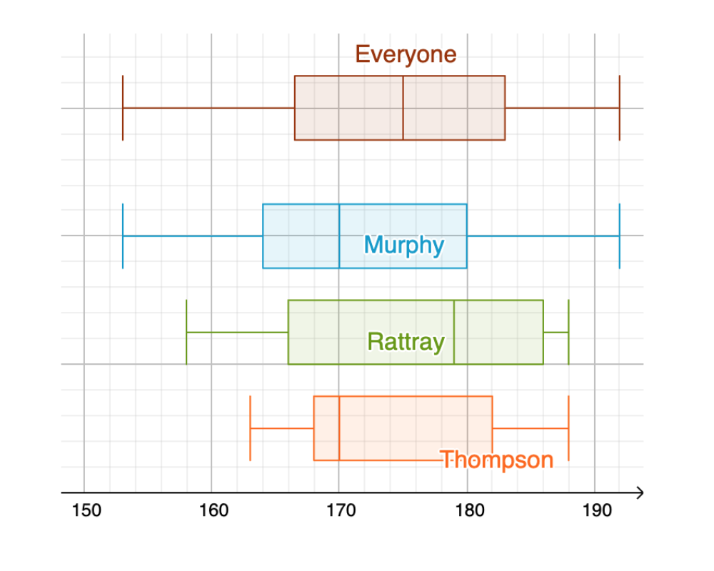
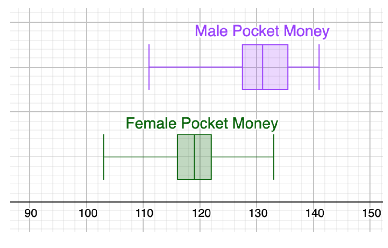
Comparative boxplots are one of the most powerful tools for a statistics exploration — use them whenever you are comparing a continuous variable across two or more groups. Always justify your choice of median vs mean. The footnote in the original model notes that skew is "just outside the scope of the course" — this kind of sideways-comment demonstrates awareness of mathematical ideas beyond the syllabus (Criterion E sophistication).
A scatter plot of height (cm) vs pocket money (CHF) shows a positive correlation (r = 0.84), regression line y = 0.6688x + 8.2094. The report interprets the slope in context: "for each cm in height you might expect to receive approximately 0.67 CHF extra in pocket money." It immediately flags gender as a possible confounding variable, noting that males are on average taller and might receive more pocket money regardless of height.
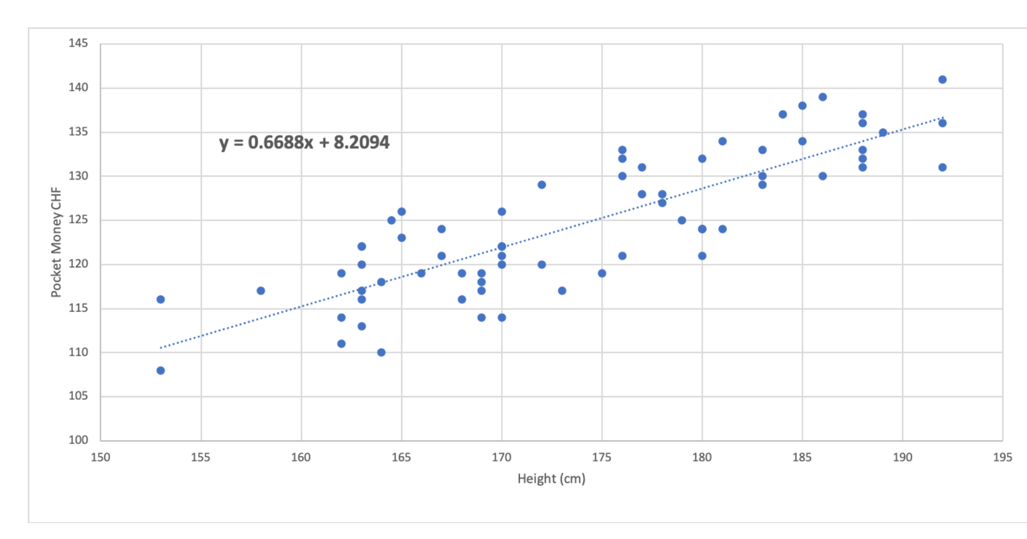
Interpret r AND interpret the regression equation in context (slope in real-world units; y-intercept meaning). Then explicitly ask: "Is this really what it seems?" Identifying a confounding variable and flagging it immediately is the hallmark of critical thinking (Criterion D reflection). Note: a footnote in the original admits the pocket money data was fabricated for teaching purposes — in a real exploration, do not do this.
Two formal tests are presented: (1) χ² test for independence — gender vs pocket money (H₀: independent; H₁: not independent). Observed and expected frequency tables shown. χ² = 30.1, p = 0.0000028. Conclusion: reject H₀ at 5% significance. (2) t-test — mean happiness of females vs males (H₀: no difference in means). p = 0.532. Conclusion: fail to reject H₀.
Always state H₀ and H₁ before presenting any test result. Use correct symbols (χ² not X2; subscript notation H₀ not H0 — copy–paste from Wikipedia if needed). Show observed AND expected frequency tables for χ². Interpret the p-value against your stated significance level and write a full conclusion sentence that re-references the original hypothesis. "We fail to reject H₀" is more precise than "we accept H₀."
The report concludes: gender and pocket money are not independent; gender and happiness show no significant difference. The scatter graph shows a strong height–pocket money correlation, but height and gender are also correlated, so causation cannot be established without a larger study. The article from "fakenews.com" needs further scrutiny.
The conclusion should loop back explicitly to the research question. Summarise what you found AND what you could not establish. Resist the urge to list everything you "could have done" — if something was worth doing, you should have done it. The strongest conclusions are honest about limitations throughout the report, not just at the end. The final sentence dismissing "fakenews.com" closes the narrative loop from the introduction.
Writing Structure
- Introduce your interest and the real-world context
- Explain the problem and its subtleties
- Explain the journey you will go on
- Tip: often best written last, using the future tense
- Present a simple, concrete version of your scenario
- Make it easy for a reader to understand at a glance — tables, a clear variable definition
- This is where most students start their actual writing
- Solve the simple version of the problem
- Present your mathematics clearly — graphs, tables, and equations with labels
- Articulate the logic between steps; do not just substitute numbers into formulas
- Ask 'what if?' and 'I wonder what happens when…?'
- Ask 'when is this solution not valid?'
- Ask 'can I make this more sophisticated?' — a second variable, a different test, a grouped analysis
- Summarise what you aimed to do
- Summarise the journey — what you tried, what surprised you
- Summarise the answers to your research question
- This is not the place to list things you 'could have done' — those should have been done.
- Sophistication (HL): Use challenging concepts, or use SL concepts in complex, unexpected ways
- Rigour: Clear logic and justified mathematical claims — never 'this graph shows…' without stating what the graph shows
- Relevant: Every piece of mathematics must support your exploration's aim — cut anything that doesn't
- Demonstrated understanding: Show your reasoning, don't just substitute into formulas
Data to Explore
Pick a dataset, or collect your own. Every technique from the model report works on any of these. Want real-world data instead? Browse the curated data sources — Gapminder, Our World in Data, Kaggle and more.
Data Detective
Three small datasets that look ordinary until you draw the right picture — summary statistics can mislead, and these show you how.
Large Population Dataset
Height, weight, IQ and sport data for hundreds of people — plenty for correlation, normal distribution work and comparing groups.
Car Showroom Data
Used-car age against price. Fit a linear model, say what the slope and intercept mean, and find where the model stops working.
Collect Your Own
Design a short survey, collect data from your class, and analyse it — own data is the strongest route to Personal Engagement marks.
- Decide on your research question
- Design a Google Form with 6–10 questions (mix discrete + continuous)
- Collect responses from 20+ people
- Export to Google Sheets and begin analysis