One Graph, Two Stories: the Power of Log Scales
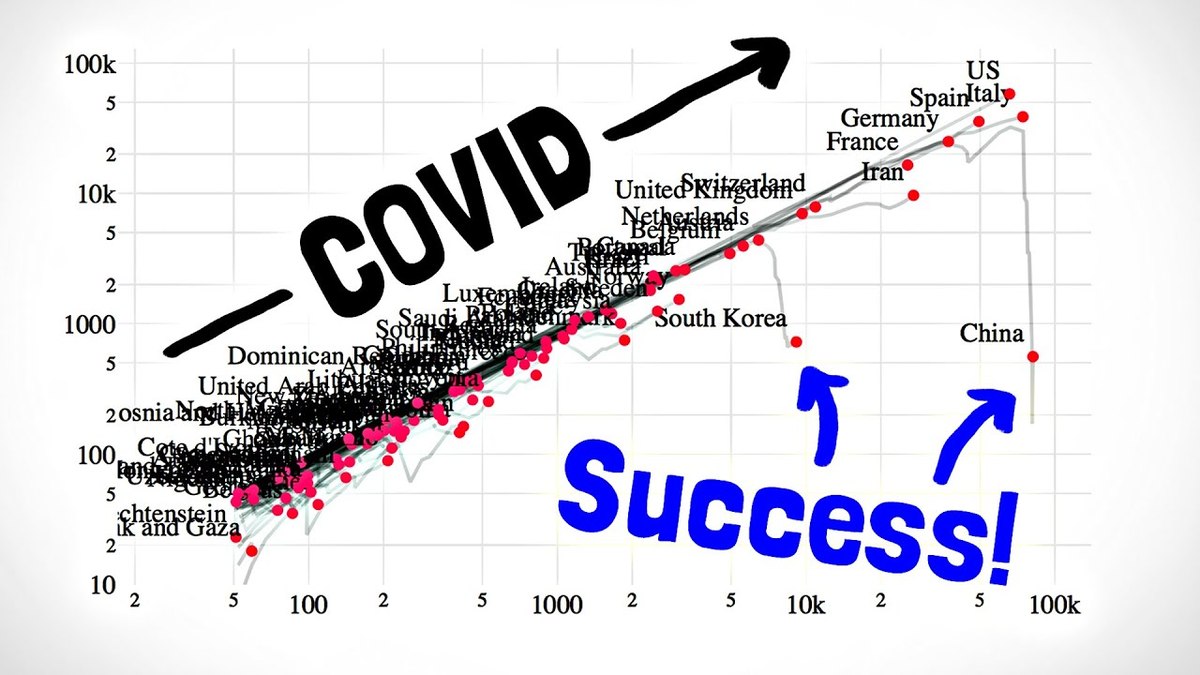
Plot a pandemic, a YouTube channel or world population and you get a hockey stick where the early story is invisible. Change one thing about the axis and the same data turns into a straight line that tells you the growth rate.
Where this idea comes from
Start here — these are the sources that inspired this exploration.
Introduction
Some things grow by ADDING (your height each year); others grow by MULTIPLYING (cases of a virus, subscribers of a rising channel, money earning interest). Ordinary graphs are built for adders, which is why multiplying data looks like a useless hockey stick. A log scale is a ruler built for multipliers: equal steps mean 'times ten' instead of 'plus ten', multiplying data turns into straight lines, and the slope becomes the growth rate. MinutePhysics used exactly this trick to show, in one chart, whether countries were beating COVID. A note before you start: the exploration is about the SCALE — what taking logarithms does to numbers and shapes. Your chosen topic, however interesting, is just the data supply.
Guiding Questions
- Find a dataset that grows by multiplying — early pandemic cases, a channel's subscriber history, world population, a bank balance under compound interest. Plot it normally. What can't you see?
- Now take the logarithm of each value and plot that instead. What happened to the shape — and what do equal vertical steps mean now?
- Your new graph is roughly straight. Measure its slope and translate it into plain language: how long does the quantity take to double? Where the line bends, what changed?
- Compare two datasets on the same log axes — two countries, two channels, two investments. The picture makes a comparison that raw numbers hide: what is it?
- Find a published graph that uses a log scale without saying so prominently. Explain what a casual reader would misunderstand — and when a log scale could be used to mislead.